Valentine's Day approacheth. I've already done an entry about the origins of Valentine's Day -- which, by the way, is far more bloody and insane than anything our capitalism-saturated culture could have come up with today.
Since I've already done that, I thought, what about the heart shape that we draw? It bears pretty much zero resemblance to our actual anatomical heart in our body. I know that we were drawing the heart shape long before we had an inkling what our anatomical heart looks like, so it's no surprise that the two have little relationship to each other. So where did we get the idea for that shape?
 or

Heart symbol Model of an anatomical heart
(Image from Wikipedia) (Image from Heart Research UK)
Well, so I've done some reading.
How we came to draw the shape of the heart the way we do, and how it came to be imbued with all sorts of metaphor and symbology -- my heart, my love, my sweet, my dear -- is one of those things that happened slowly, over time, and yet also in so many different ways, nobody can put a precise time stamp on what happened when, or first.
So we don't really know exactly how we came to draw that heart shape and call it what we do. We just keep drawing it and equating it with love. But, every once in a while, people like me get curious about where that symbol came from, and they try to figure it out. They come across the multitude of theories but settle on one or two that they like the best.
It is my theory that the story you think is the most accurate about where the heart shape came from actually says a lot more about how you define the nature of love than it does about history or facts or anything like that.
So, of the theories I am about to present, which one will you decide is the most accurate?

Ivy in real life: green, stubborn, persistent, hard to eradicate. A good metaphor for love?
(Image from Wikimedia)

Here's Dionysus, god of wine and theatre and ecstasy, crowned with a wreath of ivy. Note that the shape of the ivy leaf is similar to our heart-shaped symbol today. Note also the pine cones to his left and right. Pine cones will come up again later.
(Image from Greektheatre.gr)
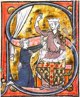
From the 1250-ish French manuscript, Roman de la Poire, here depicting a lover kneeling before the woman he loves, offering her his heart.
(Sourced from Wikipedia)

Adrea Pisano's Charity (Caritas), one of the bronze panels on the Baptisterium in Florence, c. 1337.
(Image from Wikipedia)

Imagine this turned upside down so the point is pointing up. OK, now think of various bits of naked anatomy.
(Heart shape from The Graphics Fairy)

This is a Renoir painting, done in 1918-1919, so much, much later than when the Medievalists were making their manuscripts. But this gives you several possible sources of the heart shape in one painting. Could the heart be based on the shape of a woman's bottom, as shown at right? Or is it perhaps the shape of her breast, like the one that comes to a very defined point at left? Or could it be based on both breasts together, as shown at center?
(Renoir's Grandes Baigneuses from France This Way)

HEY! GOOGLE CENSOR MORONS! THIS IS FROM ONE OF THE FINEST WORKS OF SCULPTURE OF ALL TIME! MICHELANGELO'S DAVID! You idiots. OK, readers, if you want to see the image -- no, wait, they put up the censor thing over the original source image too. Jackasses.
I don't want to leave out the male anatomy from this discussion. Here is a zoomed-in shot of a reproduction of Michelangelo's David's specials. If you imagine the heart shape turned point up, you can see how the bulges at the bottom of the [I'm going to use a phrase that won't attract prudish people's attention] pair of round items might correspond with the bulges of the heart.
(Photo from Colors Magazine)
Now I'm going to post another photo that has nothing to do with anything.

Here is a perfectly ordinary bit of sculpture.
Like a Pine Cone

Giotto's allegory of Caritas, from his fresco depicting the life of Christ, circa 1305. She is giving her heart to God above and demonstrating this by giving food to people below.
(Image from Wikipedia)
Here, again, is what an anatomical heart looks like.
(Image from Heart Research UK)
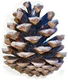
And here's your typical pine cone.
(Image from Wiktionary)

Title page from the Documenti d'amore, c. 1320, a collection of poems and other literature about love, taken from various authors including Dante etc., along with illustrations in miniature.
(Image from Google eBook version)
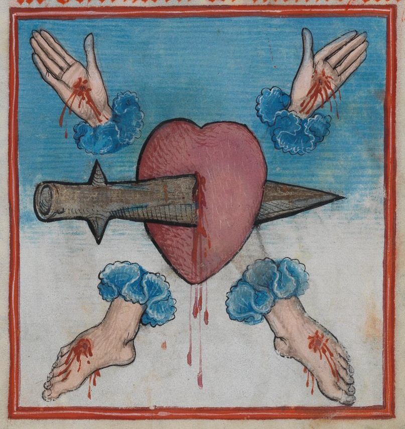
Depiction of the Five Wounds of Christ, from the Waldburg-Gebetbuch in Stuttgart. Looks like contemporary art, you say? Nope. 1486.
(Image from Wikipedia)
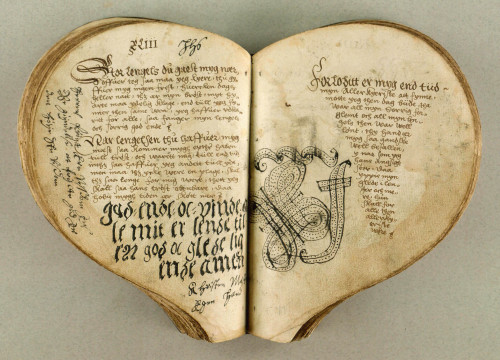
Heart-shaped book of hours, from either the 15th or 16th century (the page where this was posted is not clear about which image goes with which caption).
(Image from Damien Kampf)

Sheet music for a love song, "Belle, bonne, sage," in the shape of the heart as we draw it today, from The Chantilly Manuscript, c. 1350-1400.
(Image from The Public Domain Review)

German deck of playing cards, 1545. Note that the heart suit looks like a heart, while the I'd guess to be spades looks like ivy.
(Image from Wikipedia)
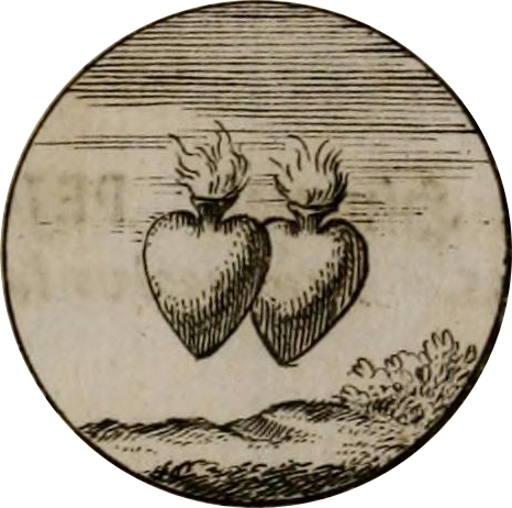
Emblem of two hearts on fire, from Devises et Emblemes Ancienees & Modernes, in 1699. This might be another one of my favorite depictions of love. We are our hearts on fire, traveling over everything and zooming through space and time together.
(Image from The Public Domain Review)

(Vector from All-free-download)
Sources
Listverse, 10 Theories on the Origins of the Valentine's Heart, February 8, 2013
Skeptics Stack Exchange, Is the heart symbol based on female anatomy?
Heart Symbol & Heart Burial
Theoi Greek Mythology, Dionysos
Art & Critique, Giotto, Virtues and Vices: Charity
Tumblr, Greek Ivy Wreath and the captions thereon
James Peto, The Heart, pp 28-29
Keelin McDonell, Slate, The Shape of My Heart, February 13, 2007
PBS American Experience, Timeline: Heart in History
Since I've already done that, I thought, what about the heart shape that we draw? It bears pretty much zero resemblance to our actual anatomical heart in our body. I know that we were drawing the heart shape long before we had an inkling what our anatomical heart looks like, so it's no surprise that the two have little relationship to each other. So where did we get the idea for that shape?
or Heart symbol Model of an anatomical heart
(Image from Wikipedia) (Image from Heart Research UK)
Well, so I've done some reading.
How we came to draw the shape of the heart the way we do, and how it came to be imbued with all sorts of metaphor and symbology -- my heart, my love, my sweet, my dear -- is one of those things that happened slowly, over time, and yet also in so many different ways, nobody can put a precise time stamp on what happened when, or first.
So we don't really know exactly how we came to draw that heart shape and call it what we do. We just keep drawing it and equating it with love. But, every once in a while, people like me get curious about where that symbol came from, and they try to figure it out. They come across the multitude of theories but settle on one or two that they like the best.
It is my theory that the story you think is the most accurate about where the heart shape came from actually says a lot more about how you define the nature of love than it does about history or facts or anything like that.
So, of the theories I am about to present, which one will you decide is the most accurate?
Greek Ivy
- A cardiologist -- I am not making this up -- named Dr. Armin Dietz who is also interested in these sorts of things says that the earliest pre-cursor of the heart shape was on Greek tombs and in Greek vase painting (amphorae). He says people covered their vases & tombs with depictions of ivy, which was supposed to be symbolic of eternal love.
Ivy in real life: green, stubborn, persistent, hard to eradicate. A good metaphor for love?
(Image from Wikimedia)
- If you think about the properties of ivy, this would seem to make sense. Ivy is constant, will attach itself to a thing and not let go. It is very hard to kill. You can cut away the leaves and stems but it will simply begin growing again. You can imagine someone saying to his or her loved one, with that ivy plant, "So too my love for you."
- This is an intriguing thought, but based on things I've read elsewhere, I think this cardiologist dude might be a little off track. Because ivy was associated with Dionysus. The god of wine and theatre and debauchery and all that. Where he's connected with ivy is that it's a symbol of life, vibrancy, passion, and immortality.
Here's Dionysus, god of wine and theatre and ecstasy, crowned with a wreath of ivy. Note that the shape of the ivy leaf is similar to our heart-shaped symbol today. Note also the pine cones to his left and right. Pine cones will come up again later.
(Image from Greektheatre.gr)
- This last bit about immortality is the important part. Because archaeologists have found various ancient Greek wreaths made with ivy or coins depicting people wearing crowns of ivy, and they are not generally described as being expressions of someone's undying love. The wreaths were either intended to be worn during a Dionysian festival, or for a funeral.
- The idea, so far as I understand it, was that the ivy was supposed to represent a wish that the person who had died would enjoy immortality -- literally, enjoy it with Dionysus and lots of wine and so on -- rather than that the living person's love would be immortal.
- So I think this cardiologist dude might be a little off the mark. But in missing the mark, I think he's probably expressing his own ideas about what love is: Immortal. I would think a cardiologist would unfortunately see a lot of people die, so he's probably hoping that true love would outlast even that.
Medieval Allegorical Hearts
- The postscript to the whole ivy idea falls in this part of history. Dr. Dietz and others say that early Middle Ages monks who were illuminating manuscripts turned the ivy leaf upside down and changed the color from green to red, to symbolize warm blood, good health--oh yeah, and love. He says you can see that transformation happening on religious manuscripts and also on playing cards.
- So one theory about this time period is that the monks were copying the Greeks, just updating the ivy with their new favorite color, red.
- But I'm not sure that theory holds because different monks/artists were making their hearts look like all different kinds of shapes, depending on where they lived or what they were writing about.
- One of the earliest-known drawings of a heart is in the illuminated letter S shown below. This is from a French manuscript made some time around 1250 A.D., and it shows a kneeling man offering his heart to his lady-love.
From the 1250-ish French manuscript, Roman de la Poire, here depicting a lover kneeling before the woman he loves, offering her his heart.
(Sourced from Wikipedia)
- That's a weird looking heart by today's standards, isn't it? It's kind of flesh-colored, he's pointing the pointy end at her, and it's rather unappealing all the way around. It looks like he went out, killed a goose, pulled out its liver, and that's what he's presenting to his lady-love. In response, she's saying, "Ew! What the hell? Get away from me with that thing!"
- But the more I look at it, the more I think this depiction is kind of great. Our love is human, and therefore of the fleshy realm, and sometimes it can be embarrassing or unwanted or unpleasant. But it is still the very core of us, the thing that makes us live as nothing else does.
- The theory about this shape is that it's based on very rough ideas of the heart's anatomy plus what emotional properties people attributed to it, so it is some combination of the anatomical/physical and the spiritual. Most of these early depictions of love were allegorical -- as this one is -- so the monks were combining earthly love for people with the concept of spiritual love. So I suppose it makes sense that their hearts would look like something combination of the fleshly and the imaginary.
Medieval Upside Down Hearts
Adrea Pisano's Charity (Caritas), one of the bronze panels on the Baptisterium in Florence, c. 1337.
(Image from Wikipedia)
- Another early depiction of someone holding their heart is on one of several bronze panels on a door, in Florence, made around 1337. Here, Charity is shown holding her heart in her right hand. It is upside down by our reckoning, and cone-shaped.
- (What she's cradling in her left arm I have no clue. It looks like a dragon, but I think, based on things I've read elsewhere, it might be a water lily. The lily was sometimes a symbol for motherhood, and Charity was often shown suckling children at her breasts. But I'm totally guessing here.)
- This point-up orientation started showing up in the 1300s, but went away again in the next century when people went back to drawing hearts with the point down.
- The explanations for the point-up orientation are extremely varied and, I think, probably our modern-day perspective laid on top of what the monks were actually thinking. Because many of the point-up theories are sexy-dirty.
- There are all sorts of various theories that our heart today looks the way it does because it resembles some part of the loved one's body -- her breasts, or his testicles, or her bottom, or her genitalia from the mons to the labia and the clitoris.
Imagine this turned upside down so the point is pointing up. OK, now think of various bits of naked anatomy.
(Heart shape from The Graphics Fairy)
This is a Renoir painting, done in 1918-1919, so much, much later than when the Medievalists were making their manuscripts. But this gives you several possible sources of the heart shape in one painting. Could the heart be based on the shape of a woman's bottom, as shown at right? Or is it perhaps the shape of her breast, like the one that comes to a very defined point at left? Or could it be based on both breasts together, as shown at center?
(Renoir's Grandes Baigneuses from France This Way)
HEY! GOOGLE CENSOR MORONS! THIS IS FROM ONE OF THE FINEST WORKS OF SCULPTURE OF ALL TIME! MICHELANGELO'S DAVID! You idiots. OK, readers, if you want to see the image -- no, wait, they put up the censor thing over the original source image too. Jackasses.
I don't want to leave out the male anatomy from this discussion. Here is a zoomed-in shot of a reproduction of Michelangelo's David's specials. If you imagine the heart shape turned point up, you can see how the bulges at the bottom of the [I'm going to use a phrase that won't attract prudish people's attention] pair of round items might correspond with the bulges of the heart.
(Photo from Colors Magazine)
Now I'm going to post another photo that has nothing to do with anything.

Here is a perfectly ordinary bit of sculpture.
- The thing is, with all these body parts arguments, I'm not sure they apply to the monks and artists of the Middle Ages. I'm sure there are those who would say, oh, those monks, since they were celibate and all, they were probably horny like crazy, so they were probably thinking dirty thoughts all the time. So they were just looking for an excuse to draw dirty things and then cover that up by calling it religious or spiritual.
- Well, maybe. But that argument seems pretty far-fetched to me. And I think we're putting our modern-day sexy thoughts on top of what people were thinking about in the 1300s and 1400s.
- Especially since these theories about the heart shape depicting naked body parts were not proposed until the 1960s or so. When people were thinking a loooooot about sex.
Like a Pine Cone
Giotto's allegory of Caritas, from his fresco depicting the life of Christ, circa 1305. She is giving her heart to God above and demonstrating this by giving food to people below.
(Image from Wikipedia)
- Here's another depiction of Charity (Caritas), this time by Giotto. She's holding up her heart, and again, it's got the shape of a smooth, spherical pine cone. Nothing about her looks especially sexy, and neither does her pine cone heart.
- There's that pine cone shape again. What's up with that?
- In the 1300s & 1400s, people were verbally describing hearts as being shaped like pine cones. This was based on people having seen actual anatomical hearts in cadavers. But maybe they only sort of saw the actual hearts.
Here, again, is what an anatomical heart looks like.
(Image from Heart Research UK)
And here's your typical pine cone.
(Image from Wiktionary)
- I'm not seeing that much of a resemblance, are you?
- I haven't found anyone who explains why it was necessarily a pine cone, as opposed to some other natural object, which people used to describe the shape of the heart.
- Could it be, they were thinking of Dionysus and his pine cones?
- Nah. Probably not. Most likely there's no buried psychology here, only an effort to try to liken this weird, bloody, no longer pulsing thing to anything else they knew of in nature, and the nearest thing they could come up with was a pine cone.
- So I would say these pine cone-heart-depictors were doing their best to try to be as realistic as possible. They were mainly drawing or painting these hearts in a religious context, so I'd guess they were trying to say, look, here's what this very human thing which also has the rather amazing capacity to love spiritually looks like. And here's what it looks like to give this human pine cone love-thing to God. Or to one of His representatives.
Right-Side Up Hearts from Medieval Times Onward
- Depictions of the heart got flipped around so the point was pointing down some time in the 1400s. One of the earliest depictions like this comes from Francesco de Barberino's illustrated text, Documenti d'amore, first published around 1320.
Title page from the Documenti d'amore, c. 1320, a collection of poems and other literature about love, taken from various authors including Dante etc., along with illustrations in miniature.
(Image from Google eBook version)
- Yes, that overlaps in time with the upside-down depictions, but society in those days wasn't like it is today, where everybody sees the same thing almost instantly and everybody immediately starts copying the new fad. This was one of the first instances of the pointy-end down heart, that also had kind of a pinched-in curve to it. It was this shape that became the predominant one going forward, rather than the spherical pine cones.
- Perhaps the reason this is the shape that took hold is because this one is most closely associated with earthly, romantic love between people. It's not about allegorical love for God, or some wish for immortality; it's a straight-up, I Love You heart.
- There were still depictions of religious hearts -- the Sacred Heart of Jesus, for example -- but more and more, these were drawn or painted with two bulges on top and the point at the bottom.
Depiction of the Five Wounds of Christ, from the Waldburg-Gebetbuch in Stuttgart. Looks like contemporary art, you say? Nope. 1486.
(Image from Wikipedia)
Heart-shaped book of hours, from either the 15th or 16th century (the page where this was posted is not clear about which image goes with which caption).
(Image from Damien Kampf)
- But more and more, depictions of the heart were used in situations that were less religious and more often romantic or secular. And they all used the shape we've all now come to expect.
Sheet music for a love song, "Belle, bonne, sage," in the shape of the heart as we draw it today, from The Chantilly Manuscript, c. 1350-1400.
(Image from The Public Domain Review)
German deck of playing cards, 1545. Note that the heart suit looks like a heart, while the I'd guess to be spades looks like ivy.
(Image from Wikipedia)
Emblem of two hearts on fire, from Devises et Emblemes Ancienees & Modernes, in 1699. This might be another one of my favorite depictions of love. We are our hearts on fire, traveling over everything and zooming through space and time together.
(Image from The Public Domain Review)
- So the upshot is, I don't really have a hard-and-fast, historically verified explanation for you. Disappointing, I know. The best I can offer you is a depiction of what happened to the shape in artwork over time.
- But I think, having reviewed that progression, that it does boil down to the same thing: it's all an effort to represent the heart as some combination of the physical, anatomical thing that the organ is inside us, as well as a symbolic depiction of the emotion we feel. Whether it's spiritual love for God, or drooling lust for someone's shapely body, or a burning desire for another person's inner being, we've found a way to represent that. And we've managed to do so with one shape. I think that's pretty cool.
(Vector from All-free-download)
Sources
Listverse, 10 Theories on the Origins of the Valentine's Heart, February 8, 2013
Skeptics Stack Exchange, Is the heart symbol based on female anatomy?
Heart Symbol & Heart Burial
Theoi Greek Mythology, Dionysos
Art & Critique, Giotto, Virtues and Vices: Charity
Tumblr, Greek Ivy Wreath and the captions thereon
James Peto, The Heart, pp 28-29
Keelin McDonell, Slate, The Shape of My Heart, February 13, 2007
PBS American Experience, Timeline: Heart in History